ABOUT

KINGS OAK CAPITAL
Background:
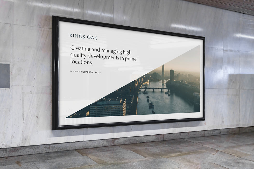
Kings Oak approached us with the goal of unifying several sub-brands under one cohesive identity. Their existing branding lacked consistency, making it harder to present themselves as a leading player in the property industry.
Our Approach:
We developed a streamlined brand identity that aligned with the company’s core values of quality and expertise. This included a new logo, an updated website, and a comprehensive set of branding guidelines to ensure consistency across all touchpoints. Our focus was on creating a visual identity that was simple, professional, and impactful, one that could bring clarity and cohesion across all of Kings Oak’s entities.
Outcome:
The refreshed brand not only strengthened Kings Oak’s position in the property sector but also gave them the tools to present a confident, unified message to clients and partners. With a clean visual system and clear guidelines in place, the company now stands out with a stronger, more recognisable identity.
PROJECT TYPE
Rebranding
DELIVERABLES
Brand Identity and Logo Design
Website Refresh and UI Improvements
Branding Guidelines for Cohesive Application
CLIENT
Kings Oak
YEAR
2023
Quality
Trust
Driven
Innovation


DISCOVER OUR OTHER BRANDS FOR
KINGS OAK

Kingston Asset Management manages Assets with integrity, improving lives of our tenants.

Kannan Construction delivers construction projects to high standard, to budget and on time.
Karter Design has extensive experience and management systems to manage property developments.